

What Colours Will Be in Vogue in 2027?
Colour is becoming confident again.
After years dominated by pale neutrals, soft greys and restrained palettes, interiors are beginning to feel richer, warmer and considerably more individual.
That doesn't mean neutral interiors are disappearing.
Instead, designers are beginning to use colour with greater intention - layering earthy shades with stronger blues, greens, reds and unexpected accents to create rooms with personality.
Current forecasts for 2027 point towards exactly that: colour that feels expressive without losing sophistication.
So, which colours should we expect to see more of next year?

1. Deep blues are becoming more confident
Blue has never really disappeared from interiors. What is changing is the way it is being used.
Rather than relying exclusively on pale or predictable navy tones, 2027 is expected to bring more saturated and expressive blues into the home.
WGSN and Coloro have selected Luminous Blue as their 2027 Color of the Year - a vivid, energetic blue designed to sit somewhere between the natural and digital worlds. At the softer end of the spectrum, powdery blues are also continuing their momentum.

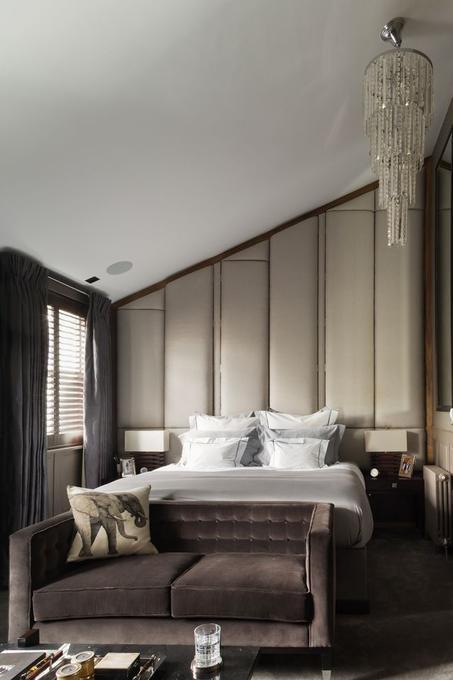
For luxury interiors, however, this doesn't necessarily mean painting an entire room bright blue. A deeper blue might appear on a wall, within a rug or through a beautifully upholstered chair. A softer blue can sit alongside warm timber, natural stone or chocolate brown.
The important thing is the relationship between the colours. Used thoughtfully, blue can bring depth and character without overwhelming the architecture around it.
2. Earthy colours aren't going anywhere
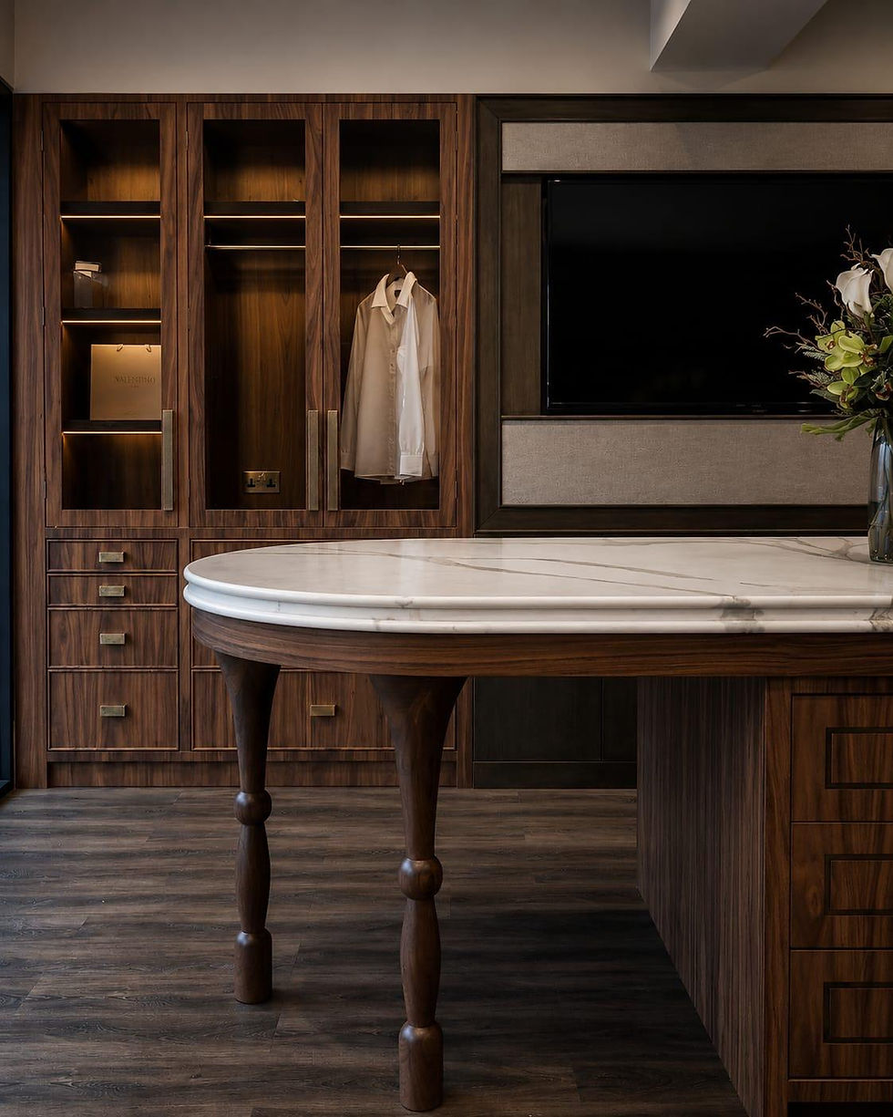
Brown has undergone one of the most significant transformations in recent interior design.
Once considered difficult or dated, shades of chocolate, umber, clay, caramel and warm earth are increasingly being used to create interiors that feel grounded and sophisticated.
Recent interiors reporting has already identified earthy umber, muddy greens, caramel and ochre as colours gaining momentum, while 2027 forecasting includes both Clay and Meadowland Green.

Earth tones work particularly well because they connect naturally with the materials already found within luxury interiors: timber, travertine, leather, wool, natural fabrics and stone.
Instead of colour being applied separately to the room, the palette can emerge from the materials themselves. A chocolate wall might sit alongside a pale carpet. Ochre upholstery can introduce warmth against stone. Deep green can complement timber rather than compete with it.
The result feels layered rather than decorated.
3. Expect unexpected colour combinations
Perhaps the more interesting story for 2027 isn't one individual colour. It is how colours are being put together.
Current forecasts point towards greater confidence with unexpected combinations, mixing grounded shades with more vibrant colours - from deep plum and bronze green to fuchsia, red, mustard and blue.

For interiors, that might mean a powder blue paired with chocolate brown. Deep green against warm ochre. Plum with a muted neutral. Or perhaps a predominantly calm room interrupted by one unexpected red chair.
The idea isn't to make every room maximalist. It is to become less afraid of contrast.
Does this mean the end of beige?
Not quite.
Neutrals remain incredibly useful in interior design. But the neutral itself is changing.
Rather than cool grey or stark white, warmer neutrals can provide a foundation for stronger colours and more tactile materials. Cream, stone, mushroom and warm beige can sit alongside richer shades without competing with them.
This is perhaps where colour trends become most useful. They shouldn't dictate the entire room. Instead, they can encourage us to reconsider combinations that we may previously have dismissed.
A beautifully designed home shouldn't look dated the moment a new colour forecast appears. The strongest interiors use colour in a way that feels connected to the architecture, the materials and, most importantly, the people living there.
Looking ahead
If 2027 has one message for colour, it may simply be this: be more confident with it.
We are likely to see deep blues sitting alongside earthy browns, natural greens, clay tones and warmer neutrals, with brighter reds, pinks and oranges appearing where a room needs energy.
But following a trend shouldn't mean copying a palette.
For Cochrane Design, colour is only one layer of an interior. It has to work with the carpet beneath it, the fabric beside it, the timber across the room, the stone, the lighting, the furniture and the architecture itself.
Because ultimately, the colour that remains in vogue longest is the one that feels completely right for the room.
5 key takeaways
Deep and expressive blues are expected to become increasingly important in 2027.
Chocolate, clay, caramel and other earthy shades will continue bringing warmth to interiors.
Natural greens work particularly well alongside timber, stone and tactile materials.
Expect more unexpected colour combinations, rather than rooms built around one safe shade.
Warm neutrals will remain important, but increasingly as a foundation for richer colour rather than the entire palette.
Reference notes
Architectural Digest - WGSN/Coloro 2027 Color of the Year: Luminous Blue.
Architectural Digest - Sherwin-Williams Colormix 2027 forecast.
Homes & Gardens - Valspar 2027 Color of the Year coverage.
Vogue - interior colour trend reporting on earthy tones and evolving palettes.